Featured Post 1 Title

Replace these every slide sentences with your featured post descriptions.Go to Blogger edit html and find these sentences.Now replace these with your own descriptions.This theme is Bloggerized by Lasantha - Premiumbloggertemplates.com.Download more free blogger templates from www.premiumbloggertemplates.com.

Read More

Featured Post 2 Title

Replace these every slide sentences with your featured post descriptions.Go to Blogger edit html and find these sentences.Now replace these with your own descriptions.This theme is Bloggerized by Lasantha - Premiumbloggertemplates.com.Download more free blogger templates from www.premiumbloggertemplates.com.

Read More

Featured Post 3 Title

Replace these every slide sentences with your featured post descriptions.Go to Blogger edit html and find these sentences.Now replace these with your own descriptions.This theme is Bloggerized by Lasantha - Premiumbloggertemplates.com.Download more free blogger templates from www.premiumbloggertemplates.com.

Read More

Featured Post 4 Title

Replace these every slide sentences with your featured post descriptions.Go to Blogger edit html and find these sentences.Now replace these with your own descriptions.This theme is Bloggerized by Lasantha - Premiumbloggertemplates.com.Download more free blogger templates from www.premiumbloggertemplates.com.

Read More

Featured Post 5 Title

Replace these every slide sentences with your featured post descriptions.Go to Blogger edit html and find these sentences.Now replace these with your own descriptions.This theme is Bloggerized by Lasantha - Premiumbloggertemplates.com.Download more free blogger templates from www.premiumbloggertemplates.com.

Read More

Join The Community

Premium WordPress Themes

Tampilkan postingan dengan label Photoshop. Tampilkan semua postingan

Minggu, 14 Agustus 2011

Photoshop Trick; CREATING AN ANIMATED FAVICON

NOW THAT YOU have learned to make a basic favicon in Technique #7, “Creating a Favicon,” you’re ready to create your own animated favicon. Th e motion in an animated favicon is created in a simple “frames-based” GIF animation, which requires no Flash and only takes a few more minutes to construct than a regular GIF favicon. Even better, all you need to make your animated favicon is Photoshop and the artwork you’ll be using for the two or more “frames” of the animation.

STEP 1 
Start by creating the fi le that holds the animation graphics. Select File > New to open the New document dialog box. Under Preset choose Web, set both the width and height to 16 px, and click OK.
HINT: If you’d prefer to work in a slightly larger fi le size, set the width and height to 64 px. Then, before you save the file as an animated GIF, just remember to scale the file down to 16×16.
STEP 2 
For this technique, you will need four layers: three separate graphics (one on each layer) and a 1 px border layer. Paste all the artwork you’d like to use in your animation into the open document, placing each image to be used in the animation on to its own layer, one above the other, in the order in which they should appear, starting from the bottom.
Be sure to name each layer appropriately (frame 1, frame 2, and so on) so that the animation is easy to configure. For example, in the animated GIF favicon used on the Luckychair.com Website, the fi le consists of four layers—one for each of the three frames of the animation, and a fourth layer called border that will also be visible in each frame of the animation, as illustrated in Figure 8-1.
To create the border layer, select the layer called frame 3 and click the Create New Layer button at the bottom of the Layers panel. Th en press Ctrl+A/Ô+A to select the entire layer, select Edit > Stroke to apply a 1 px inside border in the color of your choice, click OK, and name your layer border.

STEP 3 
Select Window > Animation to open the Animation panel. Here is where you will set up the frames-based animation. By default, the Animation panel opens to the Animation (Timeline) view. To switch the display to the Animation (Frames) view, click the Convert to Frame Animation button in the bottom-right corner of the panel.

STEP 4 
In the Animation (Frames) panel, you’ll notice that the fi rst frame of the animation is labeled with a “1” and has a time delay set to 10 seconds, which is a little too long for an animated favicon. Click on the Delay menu where it says “10 sec” and adjust the delay to 5.0 seconds.
Next, over in the Layers panel, adjust the visibility of your layers so that only the layers (frames) you want to appear in frame 1 are showing. For example, for frame 1 in the Luckychair animated favicon, the layers for frame 1 and border are visible, while the layers for frame 2 and frame 3 are hidden, as shown in Figure 8-2. This sets the scene for frame 1.

STEP 5 
To add two more frames to your  animation, click the Duplicates Selected Frames button at the bottom of the Animation panel twice. Th en make the following adjustments to the each of the new frames:
  • Select frame 2, adjust the time delay to 0.2 seconds, and toggle the visibility of the layers in the Layers panel so that only the correct layers for frame 2 are visible. In other words, make frame 2 and border visible while hiding frame 1 and frame 3
  • Select frame 3, adjust the time delay to 0.2 seconds, and toggle the visibility of the layers so that frame 3 and border are visible and frames 1 and 2 are hidden.
Figure 8-3 shows how each frame in this example should be confi gured in the Layers panel.
STEP 6 
To preview the animation in the Animation panel before saving it, select frame 1 and press the panel’s Play button. Notice that the animation plays once and then stops. Hmmm . . . that’s not good. To make the animation play endlessly, adjust the playback frequency by choosing Forever from the Looping Option menu in the lower-left corner of the panel. Now try playing the animation again and you’ll see the animation continuously loop. Ahhh—much better.

STEP 7 
Select File > Save For Web & Devices to save the fi le as an animated GIF. When the dialog box opens, select GIF 128 No Dither from the Preset menu and click Save. Th en, in the Save Optimized As dialog box, select the location where you’d like to save your fi le, set the filename to favicon, set Save as Type to Images Only, and choose Save.
HINT: To preview your saved animated GIF fi le before adding it to your Website, drag and drop the fi le into any open browser window.
STEP 8 
Now you are ready to use your animated GIF as a favicon. Upload the favicon.gif file to the root level of your domain and add the two lines of HTML code below to the <head>…</head> of every page on your site on which you’d like the icon to appear. After you’ve added the code, be sure to upload the updated pages to the server too.
<link rel=”shortcut icon” type=”image/ico” href=”/favicon.ico” />
<link rel=”icon” type=”image/gif” href=”/favicon.gif” />

Sabtu, 13 Agustus 2011

CREATE A WAVY BLACKBERRY STYLE WALLPAPER DESIGN

INTRODUCTION
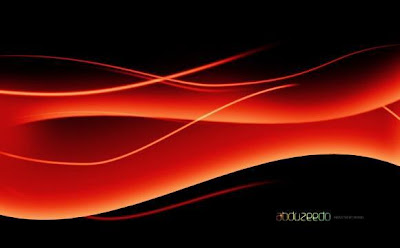
In this tutorial I will show you how to create an abstract background image using Photoshop only. The design has a cool wavy pattern with interesting lighting effects, like the Blackberry 9000 wallpaper. This is a tutorial you can sit down and complete in less than an hour. Let's get started.

Step 1:
Create a new document, using a black color for the background.
Step 2:
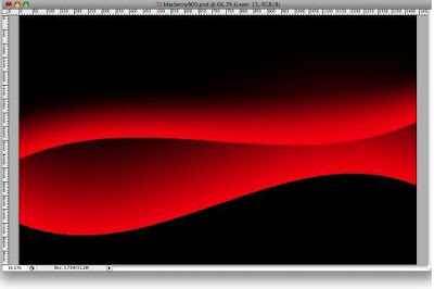
With the Rectangular Marquee Tool (M), create a rectangular selection. Then select the Gradient Tool (G), and use red for the color of the gradient for both the start and the end, but use 100% and 0% for the Opacity so the gradient will go from red to transparent. Then create a new layer and fill it with the gradient, as in the image below.
Step 3:
Go to Edit>Transform>Distort and distort the rectangle, as in the image below.

Step 4:
Go to Edit>Transform>Warp. Then select Flag and use 20% for the Bend.

Step 5:
Create another Rectangle and fill it with the same red to transparent gradient. Set the height smaller than the first one. Then repeat the Warp command; however, this time make it to the opposite way, as in the image below.

Step 6:
Let’s add a Layer Style to the shape. Go to Layer>Layer Style>Inner Shadow, use a light pink color (#ffb3b3). Set the Angle at -90 degrees, Distance 45px, Choke 0%, and the Size 70%.

Step 7:
Now go to Filter>Blur>Gaussian Blur, use 2px for the Radius.
Step 8:
Repeat Step 6 for the other shape.
Step 9:
With the Pen Tool (P), create some paths, as in the image below. We will use them to create some light effects.
Step 10:
First create a new folder, and rename it "Lines". Then change the Blend Mode to Screen. Thereafter select the Brush Tool. Grab a basic brush with 0% Hardness and 13px size. Then with the Direct Select Tool (A), select a path. With the right button of the mouse choose Stroke Subpath. Then the dialog box will open. Make sure that Simulate Pressure is not selected and Press OK.
Step 11:
Let’s create a Layer Style for the lines. Use Inner Glow with Color Dodge for the blend mode. Set white as the color, 100% Opacity, Choke 0%, and size 8px. After that select Color Overlay and use pink for the color (#ff5c78).
Step 12:
Repeat Step 10 with the other paths. Always create a new layer for each path. You can vary the size of the brush, and you can use Simulate Pressure with some paths, as I did in the image below (1, 2, and 3).
Step 13:
Let's Mask some paths, and create new ones duplicating existing paths. With number 1, select the layer of the path and go to Layer>Layer Mask>Reveal all. Then select a brush with 0% Hardness and a medium size, like 50px. Then select black for the color and start masking that line. Repeat this with numbers 2, 3, 4, and 5.
Step 14:
Here we'll make some adjustments to the shapes. Yet again, select the Shape Layer. Then go to Layer>Layer Mask>Reveal All. Then with a black brush, start masking some areas of the shapes. Tip: you can simply delete the layer as well. Just use the Eraser instead of masking it.
Step 15:
Create a new layer beneath the lines but above the shapes. Then select red and select a big 100px brush. Make sure that the Hardness is 0%. Click 1–2 times, only click enough times to create an effect like the one in the image below.
Step 16:
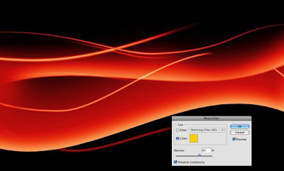
Go to Layer>New Adjustment Layer>Hue and Saturation. Make sure you select Colorize and use Hue 11, Saturation 82, and Lightness +4. Then go to Layer>New Adjustment Layer>Levels. Follow the image below for reference. After that go to Layer>New Adjustment Layer>Photo Filter. Use yellow, and Density of 85%. Make sure that you select Preserve Luminosity.
CONCLUSION
In this tutorial we created an abstract design similar to the new Blackberry's wallpaper. It shouldn't have taken you more than 40 minutes to finish. Even though it might look simple, this tutorial has very useful techniques. You can use them to create some nice lighting effects and wavy designs. Besides that, you will be able to create Vista-style wallpaper using these techniques as well (as some readers requested), just change some colors and Layer Styles and you'll have it.


Jumat, 12 Agustus 2011

CREATE A SPECTACULAR FLAMING METEOR EFFECT ON TEXT

INTRODUCTION
Take typography one step further by having text falling from the sky in a burning inferno. Yes, this is the text-on-fire tutorial to end all tutorials. It uses a little Illustrator for the text and a lot of Photoshop to burn up the screen! I will show you how to create a fire effect similar to when a spaceship or comet enters the earth's atmosphere. The image we'll be creating is inspired by a Nike Ad I saw some time ago. I'm not sure what the URL is. It's always a good idea to keep your eyes open for inspiration for effects and designs no matter what you are doing. Graphics are everywhere and you can learn a lot by looking at what other people do. Now on to the tutorial!

Step 1:
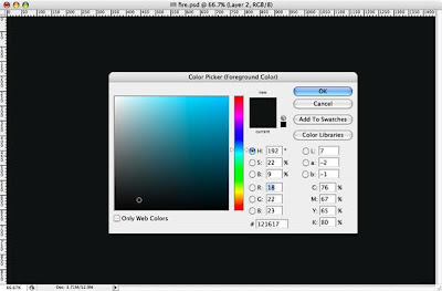
First create a new document and fill it with a dark grey.
Step 2:
Create a new layer, call it "Clouds," and using the Lasso Tool (L), make a selection similar to the one I've shown below. Set your background color to a 50% grey and the foreground to a dark grey. Go to Filter > Render > Clouds and, holding the Alt key, create clouds. After that go to Images > Adjustments > Levels, and change the input levels and output levels until you make the clouds neither too dark nor too light (see the image shown).
This layer will be on top of the others.
Step 3:
Create another layer and repeat Step 2, but this time, just change the background color from 50% gray to a blue or green color. This will create a small cloud, lighter than the big one.
Step 4:
Now we'll switch to Adobe Illustrator to create some text. I used Times New Roman for the font. After that, go to Effect > 3D > Extrude and Bevel. Now we will create the 3D text. Rotate the object and change the perspective. You can use the same values as I did (shown below).
Step 5:
1. Copy the 3D text and paste it in Photoshop.
2. Place it in the center and add some Noise (Filter > Noise > Add Noise).
3. Now let's change the Layer Style. First add Bevel and Emboss.
4. After that, let's add a Gradient Overlay.
Step 6:
1. Duplicate the Type layer and add a Motion Blur (Filter > Blur > Motion Blur).
2. Set the angle of the blur to -53.
3. Change the layer mode to Linear Dodge (Add).
4. Create a Folder, call it "Typo," and move these two layers into it.
Step 7:
Create a new layer and repeat the Step 2, this time using a selection as shown going out the back of the letter T. This will create the trailing smoke.
Step 8 (Creating the FIRE):
1 - Create a new layer and call it "fire1." 2 - With the Elliptical Marquee Tool (M), create a selection. 3 - Set the background color to light grey and the background to black. 4 - Create clouds as we did in Step 2. 5 - Change the Levels to increase the contrast; 6 - Change the Hue/Saturation with Colorize selected until you get an orange/yellow color.
Step 9:
Create a new layer, call it "blazes," and repeat Step 8. After that, duplicate the layer and call it "flames." Create a folder and move the Fire1, Blazes, and Flames layers to this folder and call the whole folder "Fire." It will be on top of the Typo layer.
Step 10:
Select the layer "blazes" and go to Filter > Liquefy. There select the Turbulence Tool (T). Now, on the edges of the fire, start creating some blazes. Use it like you would the smudge tool.
Set 11:
After the Liquefy, go to Edit > Transform > Warp and change the blaze's form to something similar to the image below. After that apply Filter > Sharpen > Sharp.
Step 12:
1. Create a new layer and call it "yellow color."
2. Create an ellipse selection with 30px feather and fill it with white.
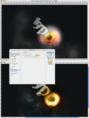
3. After that edit the Layer Style and apply a Color Overlay using an yellow color and Multiply for the layer's blend mode.
Step 13:
The order and the Blend modes for the fire are:
1. Flames: Lighter Color
2. Blazes: Normal
3. Fire1: Lighten
4. Yellow Color: Multiply

Step 14 (Sparks):
For the sparks we will use brushes. Create a folder and call it "Sparks." It will be on top of the Fire folder.
1. Inside the folder, add a new layer.
2. Fill it with black and change the Blend Mode to Color Dodge.
3. Select the Brush Tool and let's create a brush.
4. In Brush Tip Shape, change the Diameter to 12, and increase the spacing.
5. Select Scattering and set Scatter to the 1000% and Control to off. Change the Count to 2 and Count Jitter to 100%.
6. Select white and start painting some sparks.
Step 15:
Create a new layer and repeat the Step 14 but now change the Scatter Option to 0%. Start creating some single line sparks like swirls.
Step 16:
Here I used the Gomedia Spraypaint brushes to create those tiny little sparks, but you can repeat the step 14 changing the Brush size only. Basically, create a new layer, put it behind the others, fill it with black, change the Blend Mode to Color Dodge, see the color to white, and create the sparks.
CONCLUSION
Although it looks complicated, the process is actually very straightforward. I used only three or four filters, brushes, and of course, the Layer Styles. It is a mix of two other tutorials I wrote: Creating Smoke and Magic Lighting Effect in Photoshop. One thing I have to say is that it’s impossible to create exactly the same fire twice, and that’s because the filter that renders the clouds does so randomly. As always, the idea is to play around with Photoshop to get your own unique results. Hope you enjoyed the tutorial!

Smoke Type in Photoshop in 10 Steps

Last week I decided to upgrade to the new Adobe CS4 apps, as usual I did my backups and of course I forgot very important things, such as my Photoshop Brushes and Patterns. I hate when that happens, but it does happen all the time. So I had to look for my brushes and I found some really cool new ones and decided to play a bit with them and with the new Adobe Photoshop CS4.

In this tutorial I will show you how to create a smoke typography effect playing with some brushes and adjustment layers. It's a very easy tutorial and you will be able to do the whole process in 5-10 minutes.

Open Photoshop and create a new document, I used 1920x1200 pixels. Then apply a gradient, you could fill it with a gradient or apply a Layer Style. I used the layer style, Gradient Overlay. Use Radial for the Style and #07090a - #202b35 for the colors. 40 pixels for the Distance.

Now go to Filter>Distort>Wave. use 3 for the Number of Generators, 10 and 346 for the Wavelength, and 5 and 35 for the Amplitude.

Go to Filter>Blur>Gaussian Blur. Use 10 pixels for the Radius. Then group the layer and rename the folder's Blend Mode to Color Dodge. You will get a nice light effect.
Create a new layer on top of the others and go to Filter>Render>Clouds, make sure you had black and white for the background and foreground colors, then change the Blend Mode to Color Dodge and go to Layer>Layer Mask>Reveal All. With a very soft brush, 0% hardness and black color, hide some areas of the clouds layer. Use the image below for reference.
Create a new Folder on the Layers' Palette. Change the folder's Blend Mode to Color Dodge and add a new layer in it. Then use the Smoke Brushes from Qbrushes . Select white for the color and paint over some letters. If you think the brush is not very bright, just click twice.
Paint a few more smokes like the image below.
Create a new layer beneath the other layers but in front of the Background layer. Fill this layer with black and go to Filter>Texture>Texturizer. Use 100% for the Scaling and 4 for the Relief. For the Texture use Canvas and Light use Top. That will add a nice texture to the image but you will need to change the opacity to 10%.
This is a nice new feature in the new Photoshop CS4, actually there's nothing new just the Adjustments palette, but it's very useful because you can edit all the image adjustments like Levels, Hue & Saturation, Curves in that palette. However it just adds a Adjustment Layer, that could be done in the previous versions too. Anyway, on top of the other layers just add the Invert adjustment. You can go to Layer>New Adjustment Layer>Invert. It will be the same. You will get a very nice effect, like burning paper.
Conclusion
One of the best things in Photoshop is the Brushes Engine and all the things we can create with brushes. With so many excellent sites with Brushes like Brusheezy, Tutorial9, QBrushes, DeviantArt, and PSDTUTS we can find practically all sorts of effects and elements ready to be used in our designs. That means we can focus on ideas rather than figure out ways to recreate things. Also we have 2 very different effects with just one adjustment layer, the Invert. Once again, it's all about playing. I hope you enjoyed this quick tutorial, and let me know if you have any questions.